Statistics of the World
By: Chris Situ, Weiquan Mai, and Paige Mulry
By: Chris Situ, Weiquan Mai, and Paige Mulry
Overview
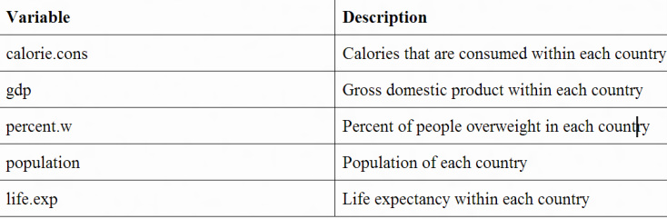
In this project we gathered five variables of data for ten randomly selected countries. The variables were calories consumed per capita, GDP per capita, percent overweight, population, and life expectancy. With this data we hope to find relationships between the sets of data. Does GDP per capita influence calories consumed per capita? Is there a correlation between percent over weight and life expectancy? These are the questions that we seek to answer.
Description of Variables
2. Plot GDP versus Life Expectancy. What is the linear correlation between the two?
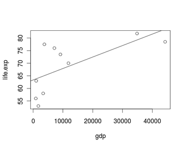
Correlation: 0.666
3. How does the mean GDP per capita of the sample compare to that of the entire world?
GDP Mean: 11,820.2 and World Mean:13,460 --> The world mean is greater.
4. Calculate the 5 number summary for calories consumed.
Min. 1st Qu. Median Mean 3rd Qu. Max.
1850 2352 2990 2943 3382 4040
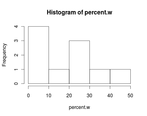
5. Is the data set for population skewed? If so, left or right?
3. How does the mean GDP per capita of the sample compare to that of the entire world?
GDP Mean: 11,820.2 and World Mean:13,460 --> The world mean is greater.
4. Calculate the 5 number summary for calories consumed.
Min. 1st Qu. Median Mean 3rd Qu. Max.
1850 2352 2990 2943 3382 4040
5. Is the data set for population skewed? If so, left or right?
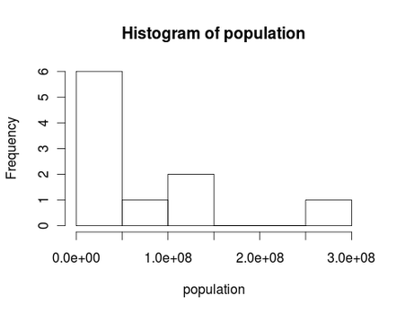
It is skewed right.
6. Calculate mean and standard deviation of population.
Mean: 73,585,600
Standard Deviation: 94,281,249
7. Construct a box plot for GDP per capita. Is the data symmetrical?
6. Calculate mean and standard deviation of population.
Mean: 73,585,600
Standard Deviation: 94,281,249
7. Construct a box plot for GDP per capita. Is the data symmetrical?
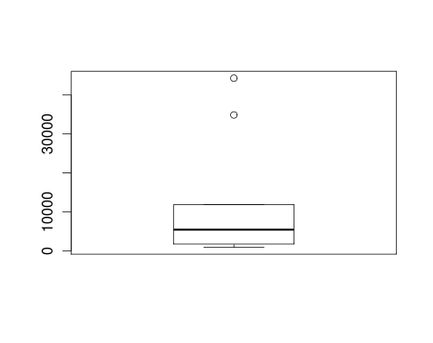
No the data is not symmetrical it is skewed right.
8. Plot calories consumed versus percent overweight. Is there a correlation between the two?
8. Plot calories consumed versus percent overweight. Is there a correlation between the two?
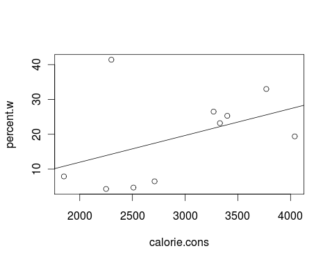
Correlation: 0.428
9. Plot GDP versus percent overweight. What is the curve of best fit?
9. Plot GDP versus percent overweight. What is the curve of best fit?
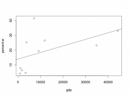
Line of best fit: y= 0.0044x+14
10. What is the degree of freedom of all the data sets?
Degree of Freedom: 9
References
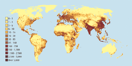
"Epidemiology of Obesity." Wikipedia. Wikimedia Foundation, 25 Apr. 2014. Web. 01 May 2014.
"List of Countries by Food Energy Intake." Wikipedia. Wikimedia Foundation, 30 Apr. 2014. Web. 02 May 2014.
"List of Countries by GDP (PPP) per Capita." Wikipedia. Wikimedia Foundation, 05 Jan. 2014. Web. 02 May 2014.
"List of Countries by Life Expectancy." Wikipedia. Wikimedia Foundation, 30 Apr. 2014. Web. 02 May 2014.
"List of Countries by Population." Wikipedia. Wikimedia Foundation, 05 Feb. 2014. Web. 02 May 2014.
10. What is the degree of freedom of all the data sets?
Degree of Freedom: 9
References
"Epidemiology of Obesity." Wikipedia. Wikimedia Foundation, 25 Apr. 2014. Web. 01 May 2014.
"List of Countries by Food Energy Intake." Wikipedia. Wikimedia Foundation, 30 Apr. 2014. Web. 02 May 2014.
"List of Countries by GDP (PPP) per Capita." Wikipedia. Wikimedia Foundation, 05 Jan. 2014. Web. 02 May 2014.
"List of Countries by Life Expectancy." Wikipedia. Wikimedia Foundation, 30 Apr. 2014. Web. 02 May 2014.
"List of Countries by Population." Wikipedia. Wikimedia Foundation, 05 Feb. 2014. Web. 02 May 2014.
