Two Sets of Data: Correlation Between Free/Reduced Meals and Math Proficiency
Research Conducted by: Deloitte and the No Kid Hungry program c. 2013
Case Study Prepared by: Arielle Goldhaber and Maddie Hernstrom-Hill
Case Study Prepared by: Arielle Goldhaber and Maddie Hernstrom-Hill
|
Overview:
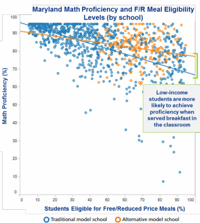
A study conducted on the correlation between the availability of free/reduced meals and proficiency in mathematics is represented in the graph to the left. This graph tracks two different school systems: the blue being a traditional school model that has fewer low-income students and the orange being an alternative school model with a higher percentage of low-income students but offers free/reduced meals. Our Task: In comparing these two systems, we seek to prove that mean test scores are improved and contain fewer outliers when students are provided with regular meals every day at school. |
10 Statistical Questions:
1. What is the correlation between math proficiency and eligibility for free/reduced meals for each set of data?
Blue: -.76
Orange: -.22
2. What is the significance of this correlation?
The significance of these correlations is that while both are negative, modern school models with more availability to free/reduced meals have succeeded in lessening the impact, improving the overall math scores.
3. What is the line of regression for each data set?
Blue: y= -.53x + 98.56
Orange: y= -.08 + 91.49
4. What are the residuals for each data set?
Blue: 1 2 3 4 5 6
-5.5678082 6.7663242 4.4297945 7.0980594 0.7615297 -30.2384703
7 8 9 10 11 12
-1.2384703 3.4297945 -6.2336758 1.7663242 4.7663242 -5.8995434
13 14 15 16 17 18
1.1004566 2.1004566 -6.5702055 -20.9019406 11.0980594 6.4321918
19 20 21 22 23 24
7.4321918 11.0932648 5.0932648 15.0932648 8.4250000 0.4250000
25 26 27 28 29 30
3.4250000 13.7567352 8.7567352 3.7567352 9.0884703 10.0884703
31 32 33 34 35 36
14.0884703 9.4202055 2.4202055 -0.5797945 -3.2336758 3.7663242
37 38 39 40 41 42
1.7663242 2.4321918 -0.5678082 12.0980594 4.0980594 3.7663242
43 44 45 46 47 48
9.4321918 6.0980594 -31.2432648 -29.2432648 -32.2384703 -30.2384703
49
-11.5750000
Orange: 1 2 3 4 5 6
2.0195103 -2.9804897 -0.9804897 -4.1027161 -5.1027161 -7.1027161
7 8 9 10 11 12
-3.2249426 -1.2249426 -4.2249426 0.6528309 1.6528309 4.6528309
13 14 15 16 17 18
0.5306044 7.5306044 2.5306044 -3.5916220 -7.5916220 -1.5916220
19 20 21 22 23 24
-20.1027161 4.8972839 -2.1027161 -0.1027161 -18.2249426 -3.2249426
25 26 27 28 29 30
3.7750574 4.7750574 -2.3471691 3.6528309 0.6528309 6.6528309
31 32 33 34 35 36
2.5306044 -1.4693956 -2.4693956 5.5306044 2.8972839 3.8972839
37 38 39 40 41 42
6.7750574 -1.2249426 -0.3471691 -1.9804897 3.0195103 5.0195103
43 44 45 46 47 48
4.0195103 5.8972839 2.8972839 -0.1027161 -1.3471691 -3.4693956
49
13.7750574
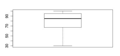
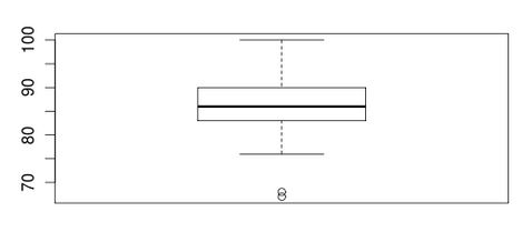
5. Make the graphs into boxplots.
Blue: Orange:
1. What is the correlation between math proficiency and eligibility for free/reduced meals for each set of data?
Blue: -.76
Orange: -.22
2. What is the significance of this correlation?
The significance of these correlations is that while both are negative, modern school models with more availability to free/reduced meals have succeeded in lessening the impact, improving the overall math scores.
3. What is the line of regression for each data set?
Blue: y= -.53x + 98.56
Orange: y= -.08 + 91.49
4. What are the residuals for each data set?
Blue: 1 2 3 4 5 6
-5.5678082 6.7663242 4.4297945 7.0980594 0.7615297 -30.2384703
7 8 9 10 11 12
-1.2384703 3.4297945 -6.2336758 1.7663242 4.7663242 -5.8995434
13 14 15 16 17 18
1.1004566 2.1004566 -6.5702055 -20.9019406 11.0980594 6.4321918
19 20 21 22 23 24
7.4321918 11.0932648 5.0932648 15.0932648 8.4250000 0.4250000
25 26 27 28 29 30
3.4250000 13.7567352 8.7567352 3.7567352 9.0884703 10.0884703
31 32 33 34 35 36
14.0884703 9.4202055 2.4202055 -0.5797945 -3.2336758 3.7663242
37 38 39 40 41 42
1.7663242 2.4321918 -0.5678082 12.0980594 4.0980594 3.7663242
43 44 45 46 47 48
9.4321918 6.0980594 -31.2432648 -29.2432648 -32.2384703 -30.2384703
49
-11.5750000
Orange: 1 2 3 4 5 6
2.0195103 -2.9804897 -0.9804897 -4.1027161 -5.1027161 -7.1027161
7 8 9 10 11 12
-3.2249426 -1.2249426 -4.2249426 0.6528309 1.6528309 4.6528309
13 14 15 16 17 18
0.5306044 7.5306044 2.5306044 -3.5916220 -7.5916220 -1.5916220
19 20 21 22 23 24
-20.1027161 4.8972839 -2.1027161 -0.1027161 -18.2249426 -3.2249426
25 26 27 28 29 30
3.7750574 4.7750574 -2.3471691 3.6528309 0.6528309 6.6528309
31 32 33 34 35 36
2.5306044 -1.4693956 -2.4693956 5.5306044 2.8972839 3.8972839
37 38 39 40 41 42
6.7750574 -1.2249426 -0.3471691 -1.9804897 3.0195103 5.0195103
43 44 45 46 47 48
4.0195103 5.8972839 2.8972839 -0.1027161 -1.3471691 -3.4693956
49
13.7750574
5. Make the graphs into boxplots.
Blue: Orange:
|
|
6. What are the quartiles of each?
Blue: 0% 25% 50% 75% 100%
30 67 85 95 100
Orange: 0% 25% 50% 75% 100%
67 83 86 90 100
7. Are there outliers, and if so, why do you think that is?
Blue: Yes, there are outliers. This is most likely because there are more variables than nutrition impacting the proficiency percentage (ie: funding, departmental politics, teacher competence.)
Orange: Yes, there are outliers, and for the same reasons as above. However, there are fewer outliers in the modern school system, suggesting that the modern system is more stable.
8. Is the data skewed or symmetrical?
Skewed.
9. What is the SD of each data set?
B: 19.1
O: 5.9
10. Why is this significant?
This further supports that the alternative school model, which gives kids more access to regular meals, has more stability and prompts higher averages of test scores among all students.
References
Augustine-Thottungal, R., Kern, J., Key, J., & Sherman, B. C. 2013. Deloitte, No Kid Hungry. Ending Childhood Hunger: A Social Impact Analysis.
(see link at bottom of page)
Supporting Information:
http://www.albertahealthservices.ca/SchoolsTeachers/if-sch-nfs-evidence-brief-school-performance.pdf
Click here to see the study summary by Deloitte and No Kid Hungry (will open in a new tab).
Click here to visit their website to learn more about their current efforts to end childhood hunger.
